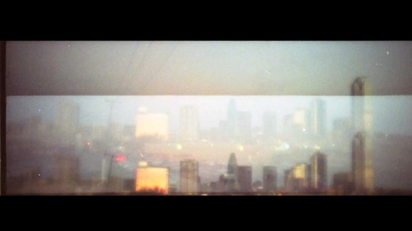
Lenscratch - Kari Werh
http://lenscratch.com/2014/04/kari-wehrs/
The blog had a more open ended design that I particularly don't like. It made finding the actual article a little bit more confusing. I prefer a more categorical design so I can see the larger gallery of articles rather than just one article at a time, so I can explore the blog easier.
To be honest I choose this article because it was the most recent one. The picture of the old man looking up was mildly interesting due to his rainbow suspenders and the fact that the subject is an older man against a gray sky. The article was about the photographer's series called
Keep Looking Up, honestly I thought the series was pretentious and very lack luster. I felt that the photographer showed to much attention to his photos and that the only way there were even remotely interesting was via subject matter rather than creative technique, even then the topic felt rather lazily chosen.


